Luna Wellness is a skincare brand centered on the idea that healthy skin starts with gentle care, consistency, and emotional balance. The brand believes skincare is more than appearance — it is a daily act of self-kindness.
Luna Wellness products are positioned as calming, skin-friendly essentials for people experiencing stress-related skin concerns such as breakouts, redness, irritation, and dullness.
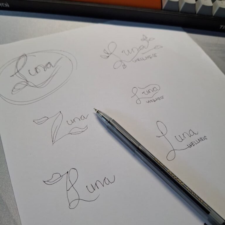
Human-Centered Design Process
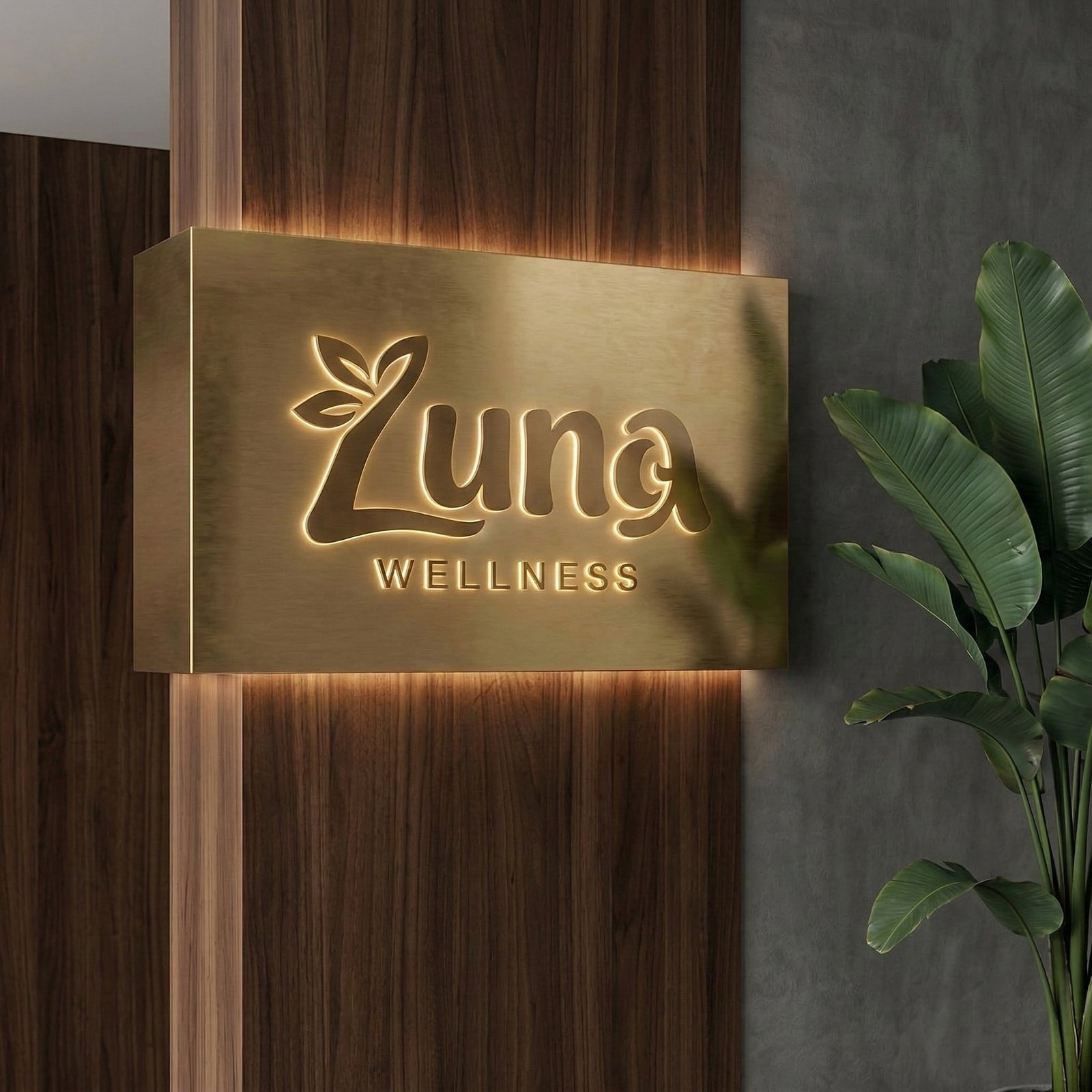
The goal was to create a logo that feels like a personal connection and evokes a sense of comfort and nurturing — key elements for the Luna Wellness brand. The process involved blending elements of natural beauty, wellness, and mental well-being, while ensuring that it felt approachable, calming, and authentically human.
Here’s a breakdown of the design choices:
1) The Word "Luna" (Handwritten and Flowing)
The “Luna” part of the logo is written in a hand-drawn, rounded, and flowing font to reflect the human connection behind the brand.
- The rounded letters convey softness and warmth, like something handwritten in your personal journal.
- It’s slightly imperfect, embracing the flaws and natural beauty that Luna Wellness wants to emphasize in its products (not about perfection, but healing).
- The smooth, gentle curves evoke a sense of fluidity, representing the calming and continuous process of self-care.
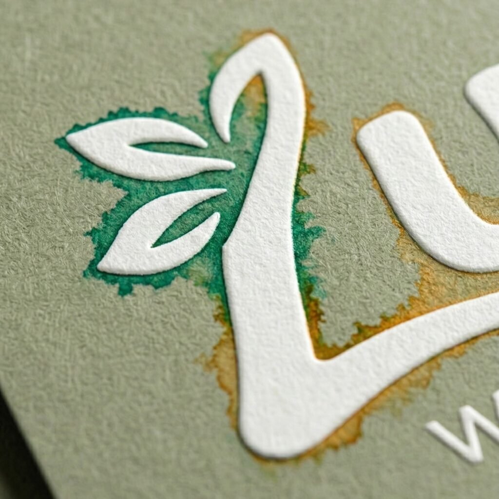
2) The Leaf
A leaf emerges from the “L,” symbolizing natural beauty, growth, and nurturing. It emphasizes the brand’s commitment to organic, earth-based ingredients and holistic well-being.
- The leaf is subtle and tucked in, just like a personal touch or reminder to pause and take care of yourself in a natural, grounded way.
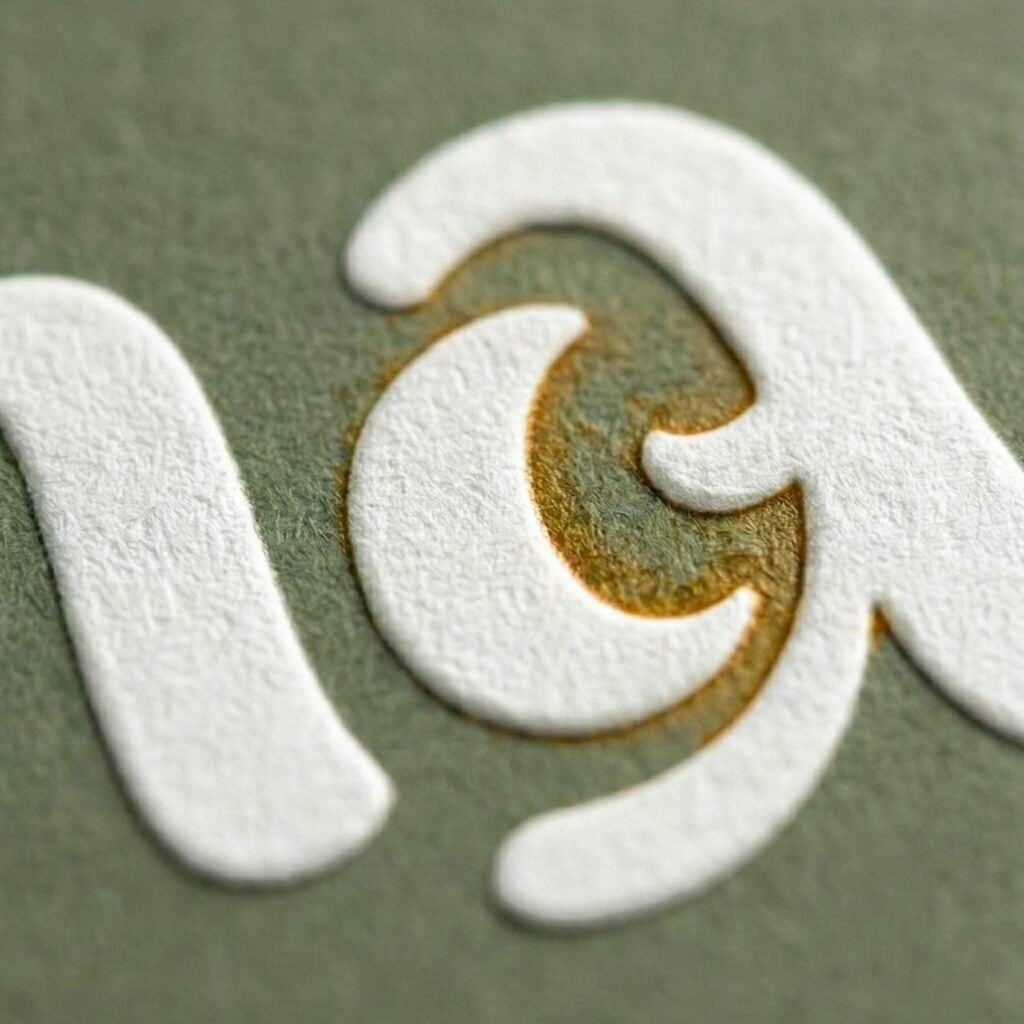
3) The Crescent Moon
The crescent moon integrated into the “n” highlights the connection to Luna, as the name suggests the moon’s calming and cyclical nature. It aligns with:
- The natural rhythms of life, and the way skin and mental well-being go through phases of healing.
- The moon is associated with nighttime rituals, often a time when self-care and relaxation are needed most, making it an apt symbol for the brand.
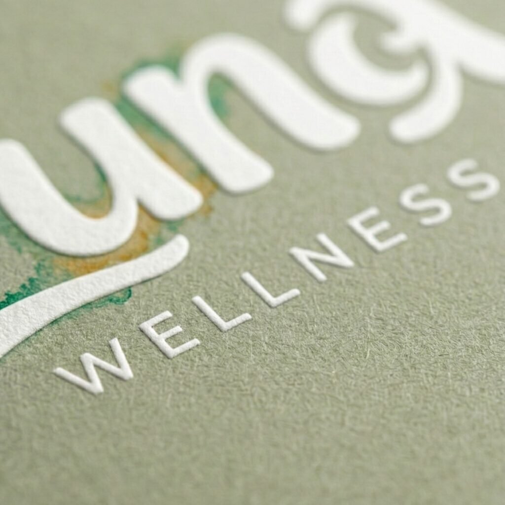
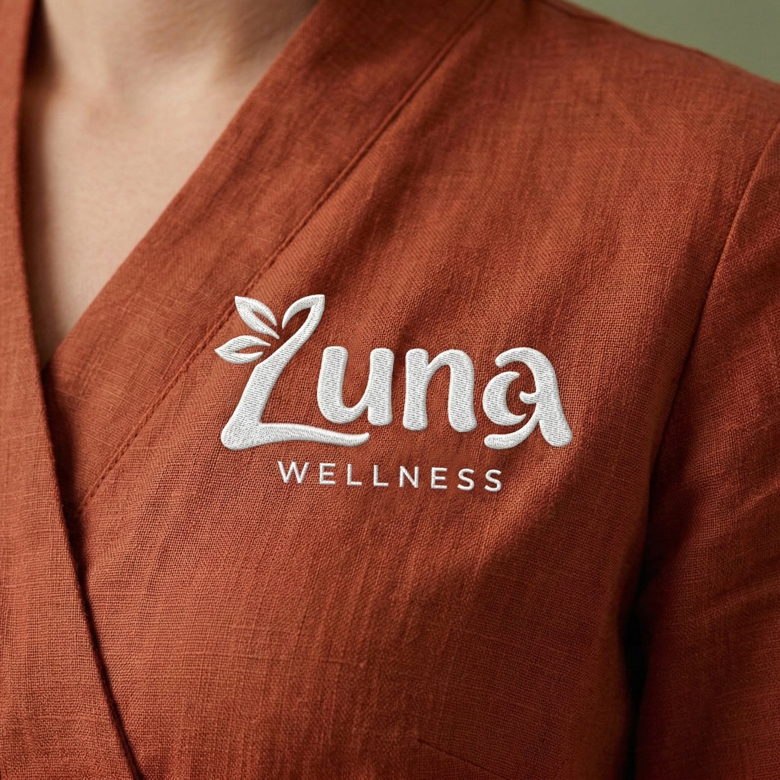
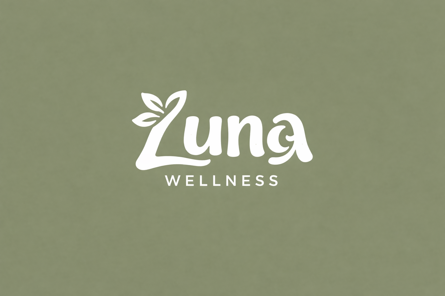
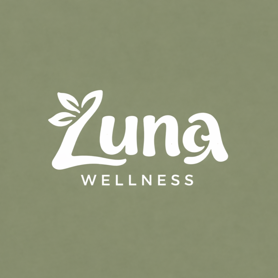
4) The Word "WELLNESS" (Modern & Balanced)
The “WELLNESS” part is placed beneath in a clean, uppercase sans-serif font, giving it a modern and grounded feel. This creates a contrast with the organic nature of the “Luna” text while keeping the focus on balance.
- The clean font also evokes a sense of clarity, representing the transparent and straightforward approach of the brand in providing quality skincare products.
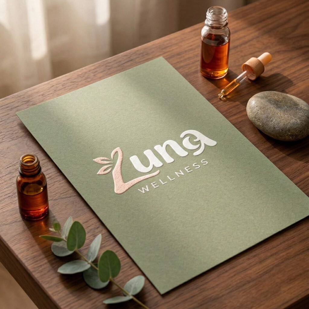
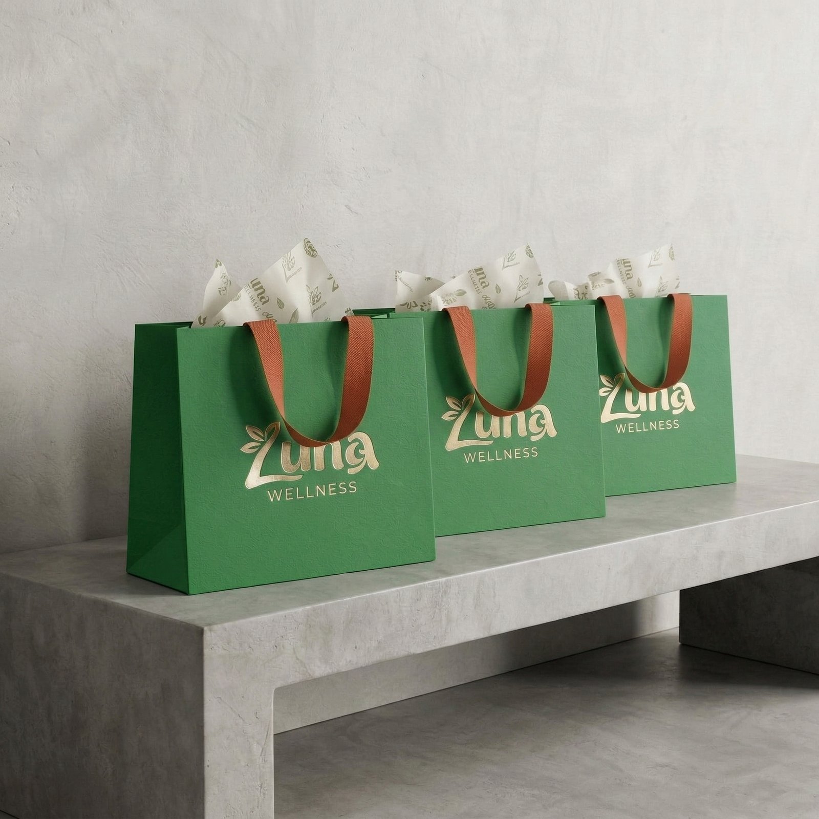
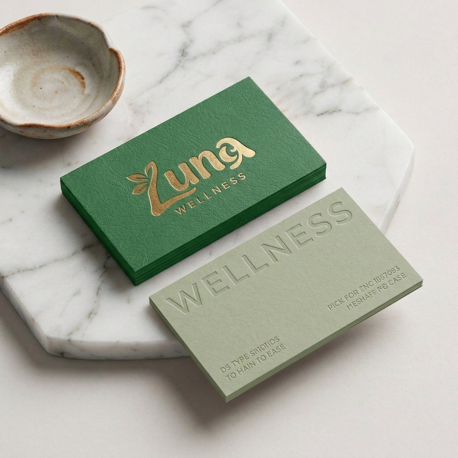
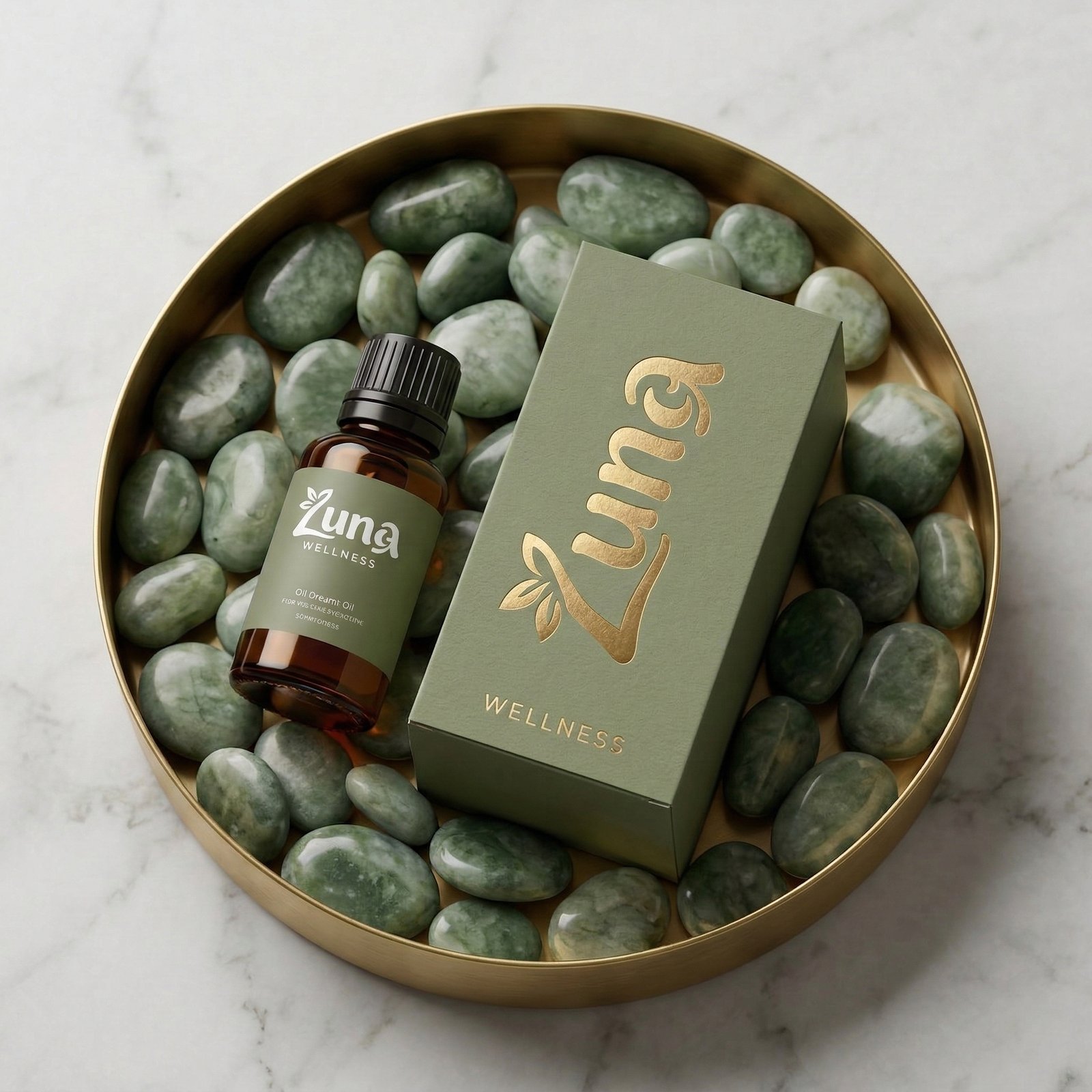
5) Green Army Background
The green army background was selected to evoke feelings of calmness, nature, and balance. The earthy tones represent a connection to the earth, while the calming green is linked to healing and relaxation.
Philosophy of the Logo
The Luna Wellness logo is more than just a visual representation — it tells a story of care, growth, and natural wellness. It symbolizes the brand’s philosophy that wellness isn’t about striving for perfection, but about nurturing and healing in a way that feels gentle, authentic, and grounded.
Key messages embedded in the design:
- Natural healing: The leaf and moon speak to the organic and holistic approach of the brand, where self-care is a journey, not a quick fix.
- Emotional connection: The handwritten “Luna” evokes warmth, making it feel like something personal and close to the heart. It’s a reminder to treat yourself with kindness, as you would a loved one.
- Balance and calm: The modern “WELLNESS” font and the sage green background bring in elements of clarity, balance, and peace, reflecting the calming nature of the brand’s skincare products.
- A human touch: The slightly imperfect design choices (rounded, flowing text and gentle moon) connect the brand to real people, highlighting its focus on authenticity and gentle self-care.