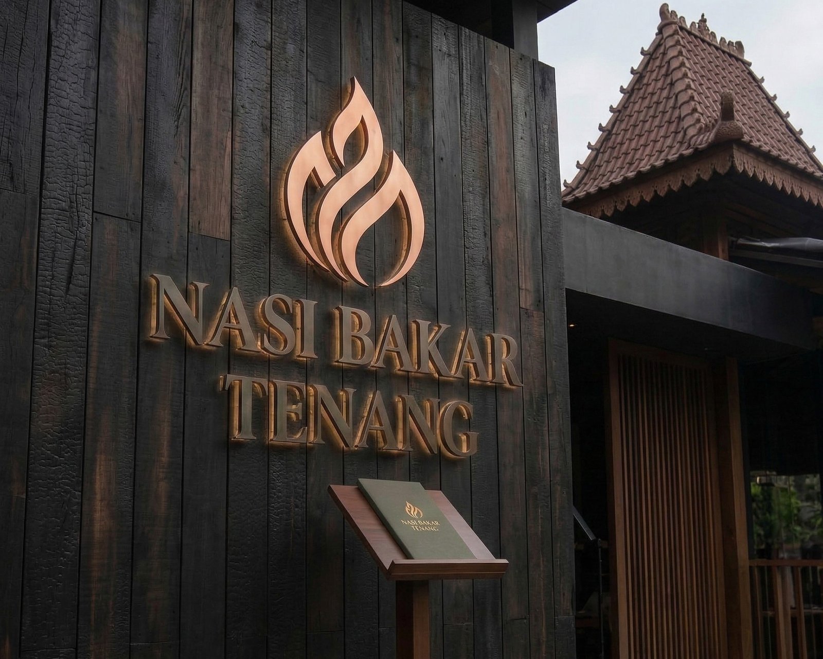
Nasi Bakar Tenang is a semi-traditional, minimalist Indonesian restaurant designed to be an oasis of mindfulness in a fast-paced world. It elevates the humble, aromatic, charcoal-roasted nasi bakar into a restorative culinary experience. By pairing authentic, spice-rich ancestral recipes with a serene, uncluttered, and earthy atmosphere, the brand invites modern professionals and seekers of quietude to slow down, savor the warmth of tradition, and find comfort in simplicity.
The Design Challenge: Reconciling Fire and Peace
As the designer behind this concept, the core challenge was figuring out how to visually balance two completely opposing forces within the brand’s name: “Bakar” (roasted/fire) and “Tenang” (calm/peace).
The Creation Story: Finding Calm in the Fire
When Budi and Tari (the founders) first came to me with the name Nasi Bakar Tenang, I faced an immediate visual paradox. How do you visually represent fire—which is dynamic, aggressive, and hot—in a way that feels peaceful, slow, and grounding?
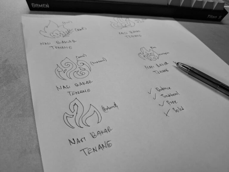
I started by sketching literal banana leaves and traditional charcoal grills, but they felt too generic and cluttered for a semi-minimalist concept. Then, I observed the actual process of making Nasi Bakar. I watched the smoke rise from the charred banana leaf. The smoke didn’t rush; it danced slowly and elegantly into the air.
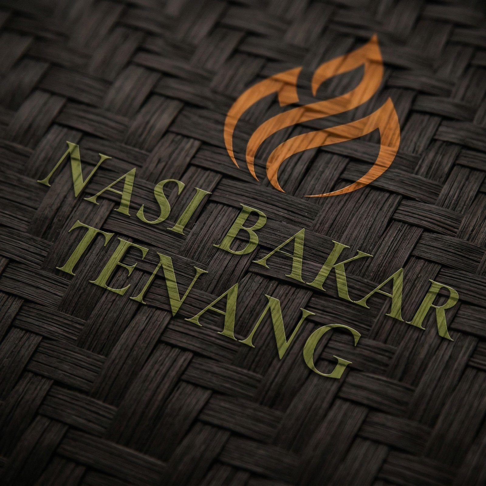
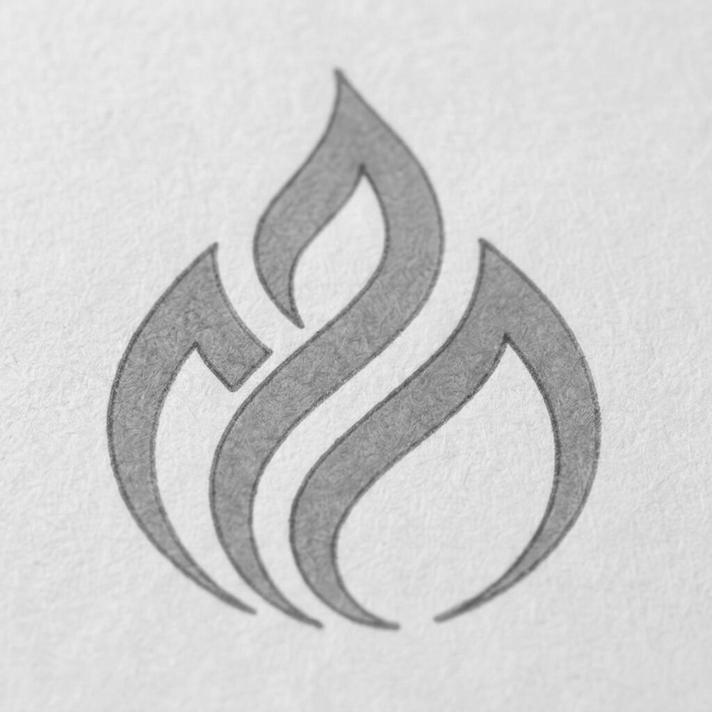
I began sketching the curves of the folded banana leaf (the tum fold). I noticed that if I swept the lines upward, it began to look like a flickering flame. To inject the “Tenang” (calm) aspect, I mirrored the lines to create symmetry. Suddenly, the shape of a blooming lotus—the universal symbol of mindfulness and peace—emerged. That was the “Aha!” moment. I refined the curves to be smooth, continuous, and perfectly balanced, resulting in the icon you see today.
Here is how that challenge broke down and shaped the logo:
The Paradox of Elements
Fire is inherently chaotic, aggressive, and energetic. On the other hand, “Tenang” demands stillness, grounding, and quiet. The challenge was to draw a flame that didn’t look dangerous or hyperactive, but rather soothing and controlled.
Avoiding Culinary Clichés
Traditional Indonesian food branding often relies on loud, literal, and busy illustrations—think bright neon reds, cartoon mascots, or highly detailed drawings of banana leaves and grills. To fit the “minimalist” brief, I had to strip away all that visual noise. The logo needed to look premium, clean, and modern, yet still immediately recognizable as traditional heritage food.
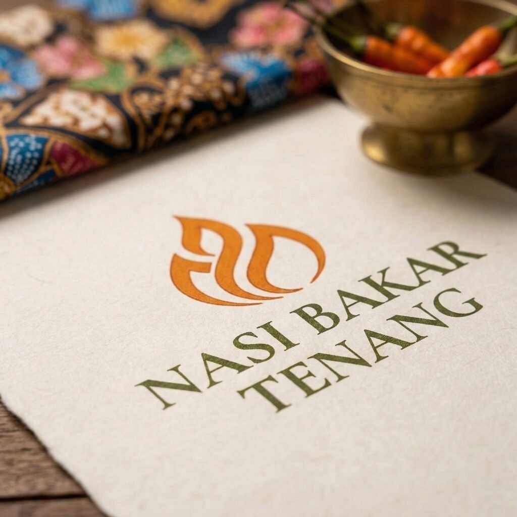

Finding the Visual Intersection
I had to find a single shape that could tell the whole story without clutter. The breakthrough was realizing that the gentle, sweeping folds of a traditional banana leaf (tum wrap) could be mirrored to look like both a warm, dancing flame and a blooming lotus flower. By using smooth, symmetrical curves and dialing back the colors to earthy terracotta and muted olive, I was able to tame the “fire” and bring out the “calm.”